
Massive shifts in internet usage have occurred due to the pervasive adoption of smartphones and other mobile devices. The proliferation of mobile technology has altered how enterprises and consumers navigate the internet. So, there's a rising requirement for flexible websites for different screen sizes and devices. This essay will discuss the advantages of responsive designs, how to implement them successfully, and the reasons behind the growing demand for adaptable websites.

The Mobile-First Revolution
Over the past decade, the number of people using their phones to connect to the internet has increased dramatically. The importance of mobile web traffic and the quality of their connectivity clearly shows how essential smartphones are in our daily lives. People can do many things now on their phones. These include tasks such as shopping, reading news, and talking on social media. Therefore, to remain competitive, businesses must focus on the target audience.
Internet usage has shifted due to the rise of mobile devices. Shorter attention spans and a penchant for rapid, readily consumable content have resulted from the widespread availability of information on the go. Websites must be mobile-friendly, meaning they load quickly and are straightforward to browse. Users are likelier to leave a website that isn't optimized for mobile devices, costing businesses valuable revenue.
The Importance of Responsive Web Design
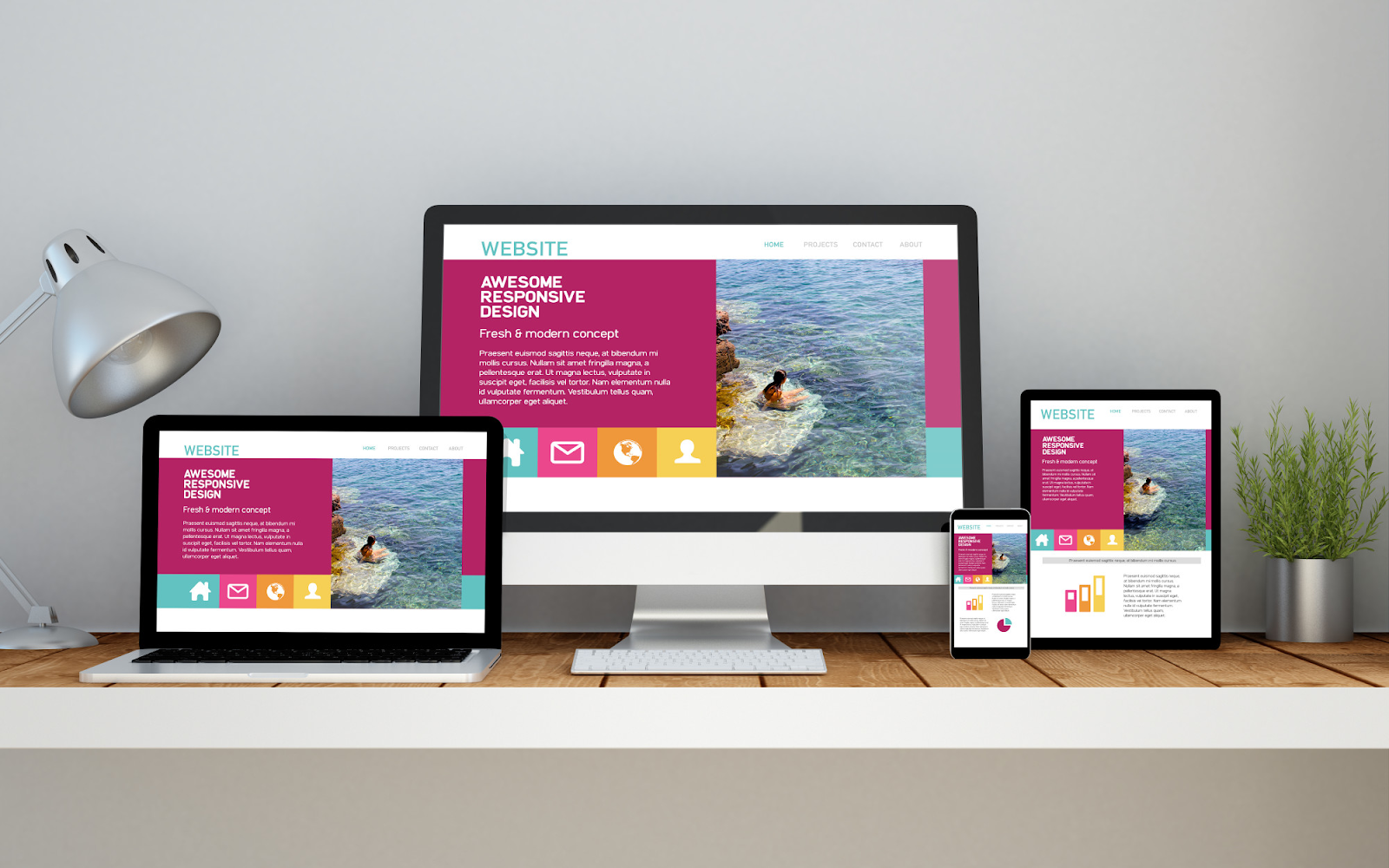
The process of developing websites that automatically adjust their appearance and content to the screen size and orientation of the user's viewing device is known as responsive web design. In essence, responsive design guarantees optimal functionality and visual appeal of a website across various devices.
- Improved User Experience
Providing a more satisfying browsing experience for visitors is a crucial factor driving the demand for responsive web design. Websites built with responsive design may adapt to the screen size of the user's device to load quickly, show content accurately, and provide straightforward navigation. Users are more inclined to stick around, interact with information, and convert when they have a good time doing it.
- Enhanced SEO Performance
Websites optimized for mobile use are given higher rankings in search results. They give responsive designs a boost in search engine rankings, making them easier to find. Moreover, in a website that is mobile-friendly, you may see an increase in organic visits from search engines. Businesses that want to be visible online might benefit significantly from a better placement in SERPs.
- Cost-Effectiveness
It can be time-consuming and costly to keep a separate mobile website updated. With cool responsive websites layout, just one version of your site is necessary for all devices. If you update or alter your website just once, the results will be consistent across all devices. As a result, website upkeep becomes simple, and expenses go down.
The Impact on Conversion Rates
Conversion rates may be significantly improved with the use of cool responsive websites. An adaptable website is more likely to convert visitors into repeat customers regardless of whether your primary goal is to sell things, promote services, or collect leads. Important features, such as call-to-action buttons, forms, and checkout procedures, are guaranteed to work correctly across all devices thanks to reactive website design. In turn, this helps boost conversion rates. Adapting to the ever-changing requirements of the digital world improves the efficiency and profitability of the company's online presence.
Ability to inspire confidence in its visitors depends on its design and responsiveness in website. Visitors can tell whether a company cares about their experience on their website and if it works well across all devices. A website's credibility may increase by preserving a superior, consistent design and user experience. Consumers are more likely to trust a business that has invested time and energy into creating a reliable and approachable online presence. It can potentially boost user involvement and encourage more of the desired behavior.
Steps to Create an Effective Responsive Website
In the modern digital age, having an adaptable website is essential since consumers use the internet from various devices. Your website will function flawlessly and look fantastic on all devices if it has a responsive web design. An excellent responsive website may be made by following these steps:
- Mobile-First Design
Take a mobile-first strategy while developing a responsive website. Design for website that is mobile friendly, then expand to other screen sizes. This method guarantees that your site displays correctly across all screen sizes, from the smallest to the largest.
- Fluid Grids and Flexible Layouts
Use fluid grids and layouts that change proportionally to fit various device widths. Don't use any elements with a set width, as they may not render correctly on some devices. Control the layout and content instead with percentages, relative units like "em" or "rem," and media queries.

- Optimize Images and Multimedia
Make sure that photos and other multimedia are optimized for mobile viewing. Make use of pictures that respond to the size of the viewport and load rapidly. Reduce file sizes without losing quality by compressing photos and video.
- Test Across Devices
Regularly test your website across various devices, browsers, and screen resolutions. It aids in problem detection and ensures all users get the same experience. Online emulators and browser developer tools can help with this google mobile friendly testing.
- Content Prioritization
Prioritize the information that will have the most significant impact on your consumers when designing for mobile devices. It prevents the need for the user to scroll or zoom to obtain the information they want repeatedly. Don't overload mobile consumers with a confusing UI.
Conclusion
The need for website designs that are compatible with mobile devices has significantly increased as a result of the shift towards prioritizing mobile usage. The proliferation of mobile devices as a means of internet access has implications for website design. Reactive website design can solve such issues along with user experience, SEO, and conversion rates. Businesses may construct mobile-friendly websites by adhering to responsive design best practices. Additionally, it has the potential to provide flawless cross-platform user experiences. A flexible website is essential in today's environment when establishing an online presence is crucial.
Now the question in your mind would be, how to design a mobile-friendly website? No worries, themespride provides you 80+ premium WordPress templates as per various categories. There is no need to create the website from scratch, we have all readymade custom themes available, that is ready to install in just one click where no coding is required.
Isn't is amazing, check our premium WordPress theme collection and choose your theme now.